Our brand logo
The myth and the image of the four rotating horses
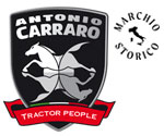
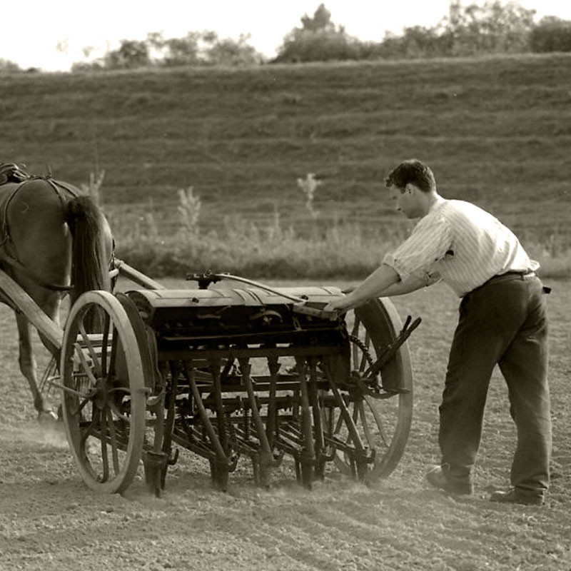
In ancient Greece, the myth was the “true speech”, that is the narration of the epic deeds of gods and heroes. The logos was the “rational speech”, which epitomizes the power and value of the myth. Similarly, the AC logo with the four rotating horses is meant to symbolize history, power, value and beauty. A modern synthesis of the evolution of agricultural mechanization since the origins of civilization, from the horse to the tractor.
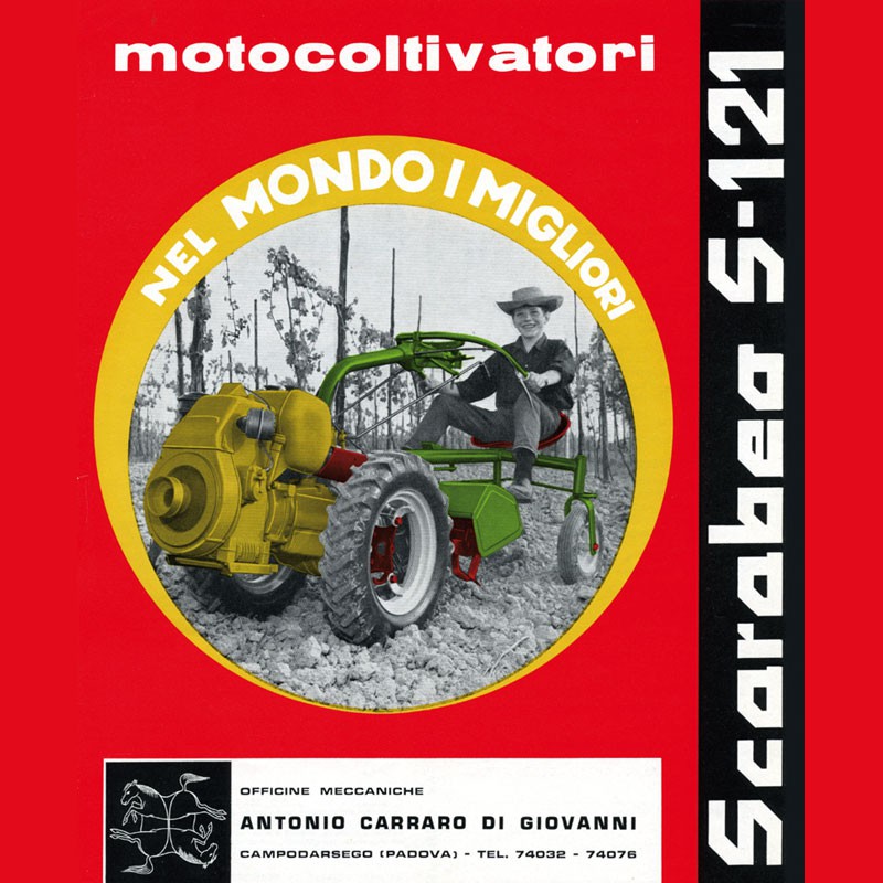
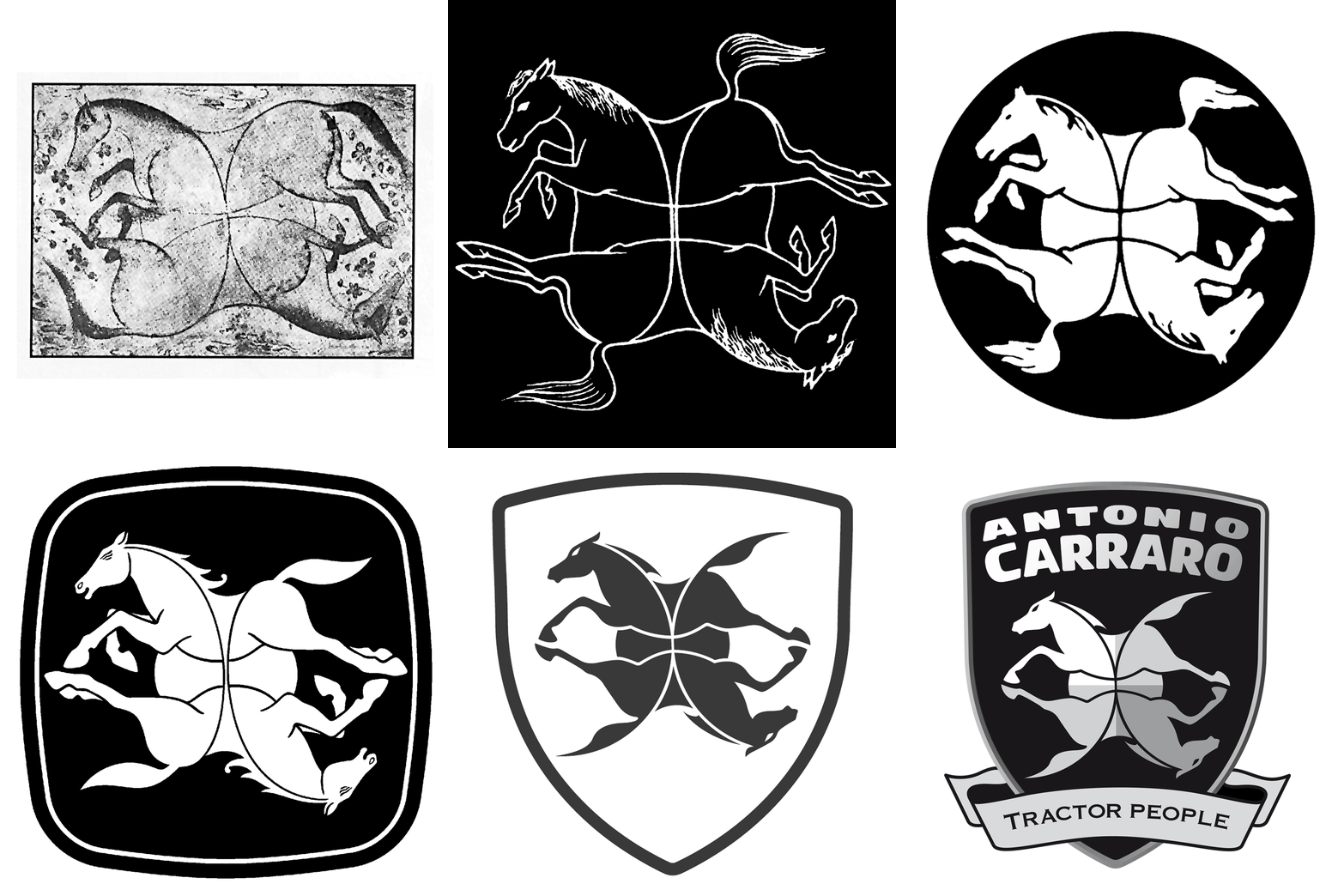
It was in 1959 that the company’s chairman Antonio Carraro, a lover of art and history, adopted this trademark drawing inspiration from a Persian graffito of the 17th century on display at Boston Museum of Fine Arts.
In ancient Greece, this type of graphical representation, named symplegma, portrayed the union of two or more similar figures producing the optical effect of multiplying the number of such figures. A symplegma is a symbol of life, rebirth, evolution and fertility; by rotating the figure around its axis, the observer will perceive a multiple image. In the AC logo there are two horses on the horizontal plane; on a closer view, however, there appear to be two horses also along the vertical axis. This is an intentional reference to the core design concepts of the AC tractors: four-wheel drive, power, multifunctionality (many machines in one), beauty. Throughout the years, the AC logo has been refreshed and revamped several times to keep up with the continuous improvements in the style and design of the Antonio Carraro products. The latest restyling takes inspiration from the Japanese manga style of drawing resulting in sharp, faceted lines that seem to have been sculpted, as if by magic, by sabre slashes. The same magic you feel when you drive an Antonio Carraro tractor.

